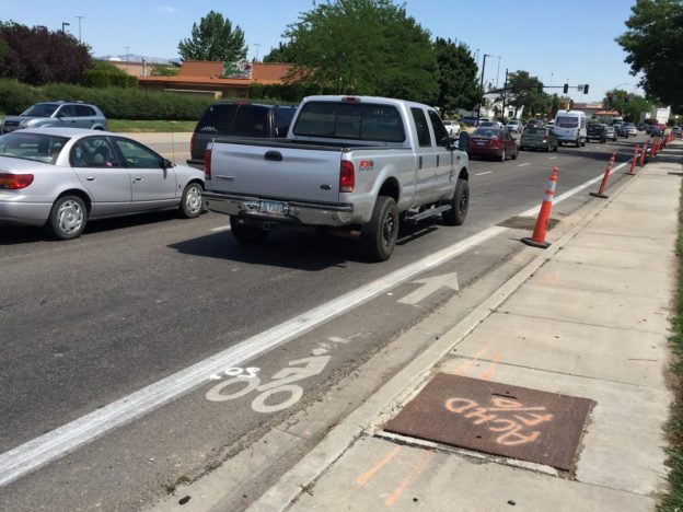
The 2019 release of the Bikeway Selection Guide by Federal Highway Administration’s Office of Safety should have ushered in a new engineering paradigm for bicyclist infrastructure. It deemed many of the nation’s existing bike lanes functionally obsolete.
If you work in transportation planning or design, you know the term functionally obsolete as one used to classify bridges.
Texas DOT describes it best: “Functionally Obsolete Bridge (FO) – A bridge that is unable to serve current traffic because of inadequate bridge width, load carrying capacity, vertical or horizontal clearances, or alignment between bridge and approach roadway.”
As with bike lanes, design studies are continually defining new ways to build safer bridges. Agencies like Texas DOT have diligently updated their own documents to ensure any new bridges meet these current standards as they emerge. Any bridges that do not meet those standards are considered functionally obsolete.
All beg buttons are push buttons, but not all push buttons are beg buttons.
Keep that in mind as you follow this wonky journey into the world of pedestrian signal actuation.
The COVID-19 pandemic has created good social media fodder about the utility of pedestrian push buttons. One camp sees all push buttons as a bad thing. Some recognize there are locations where it’s the best option. And there are push button technologies necessary for people who are blind or visually-impaired.
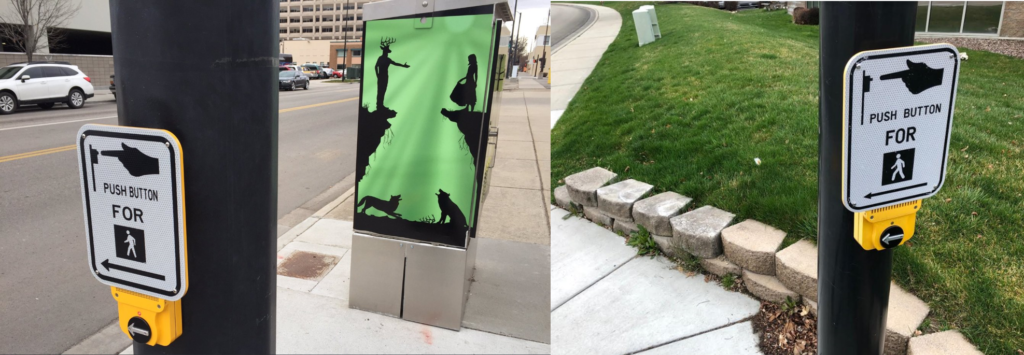
They are the exact same technology in terms of hardware and software. Both are on streets within the City of Boise, which are managed by Ada County Highway District (ACHD). But they serve two different purposes.
Left: Accessible Pedestrian Signal in downtown Boise. It does not require a person to press the button to get the walk signal. It is there to help people who are blind and vision-impaired orient toward which street to cross and provide an audible and vibro-tactile cue as to when the walk signal is activated. Right: This button is the same technology and provides the same audible cues, but is at an intersection where pushing the button is required by all users to get the walk signal.
The button on the left is at the intersection of 13th Street and Jefferson Street in downtown Boise. In Boise we are lucky that nearly all traffic signals in downtown fixed timing plans. They are programmed in what is called “recall mode.” Recall mode is where the signal phases for motor vehicles and pedestrians are displayed each cycle whether demand exists or not. No vehicle has to trip a loop detector and no pedestrian has to physically push the button.
So why do we have these push buttons downtown? They are there strictly for use by disabled people who rely on them to navigate the downtown area and orient themselves to their desired path of travel. To ACHD’s credit, they implemented this technology at almost every downtown traffic signal and maintain a list of other priority locations identified by their ADA Advisory Committee. These are referred to as “accessible pedestrian signals” or “audible pedestrian signals.” There are design requirements in terms of placement and function, as mandated in by MUTCD Section 4E.09.
The Beg The button on the right in that image above serves the same function for disabled people but is at a signal where recall mode is not deployed, meaning everyone has to push the button to get a walk signal. It is at the intersection of Parkcenter and Apple in southeast Boise. It’s the beg button we all like to mock.
It’s at an intersection where requiring a pedestrian to push the button to cross Apple is questionable. Parkcenter is the major street with 21,000 vehicles per day at this intersection. The signal cycle that provides green time for Parkcenter allows ample time to provide a pedestrian signal with the green phase to move this traffic. Apple is 65 feet wide from curb ramp to curb ramp, which means the pedestrian signal needs to be 25 seconds or so to provide minimum time for someone to cross.
The problems I see with using the same button technology and signage in the downtown and Parkcenter setting is a person using the sidewalk does not know how to determine when they must push a button and when it is not required.
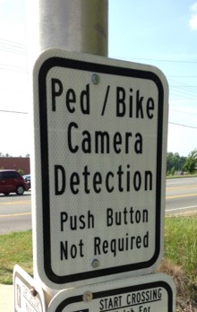
The image at right shows one potential modification to the downtown push button situation. It indicates the button is there for a specific purpose and not required to be pushed to get the walk signal. You might find your local agency reluctant to do this since that sign is not in MUTCD. But you’ll also find local examples where they’ve fabricated signs to address a local condition even if they aren’t in MUTCD. They can do it, if motivated to do it.
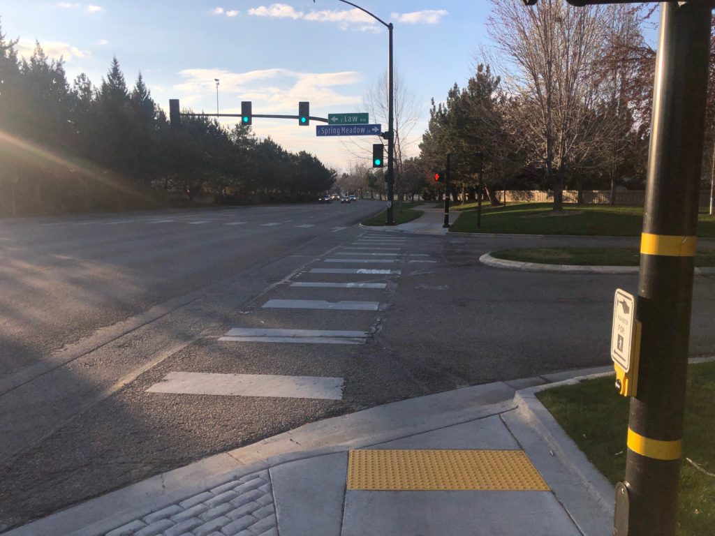
The image below shows the next signalized intersection along Parkcenter. The north leg is a private street (Spring Meadow; 800 vehicles per day) and the south leg is a public street (Law; 1,700 vehicles per day). Parkcenter is a major arterial and these side streets serve a relatively minor function in the street network. Spring Meadow (the crossing shown in the left image) serves only a few houses.
Parkcenter and Spring Meadow in Southeast Boise. (Yeah, lining up a curb ramp with a crosswalk is a hard ask for engineers.)
This situation is one where a pedestrian wishing to cross Parkcenter must push the button to actuate that walk signal. Given vehicle traffic characteristics, this is not an unreasonable request. You’ll scream long and loud to no avail trying to get a traffic engineer to use recall mode in this situation. There simply aren’t enough vehicles approaching Parkcenter from either street to program it with fixed cycle lengths. Even when motor vehicle trip the signal, there are normally only one or two. Pushing the button gives the pedestrian more time than the normal cycle length would give them.
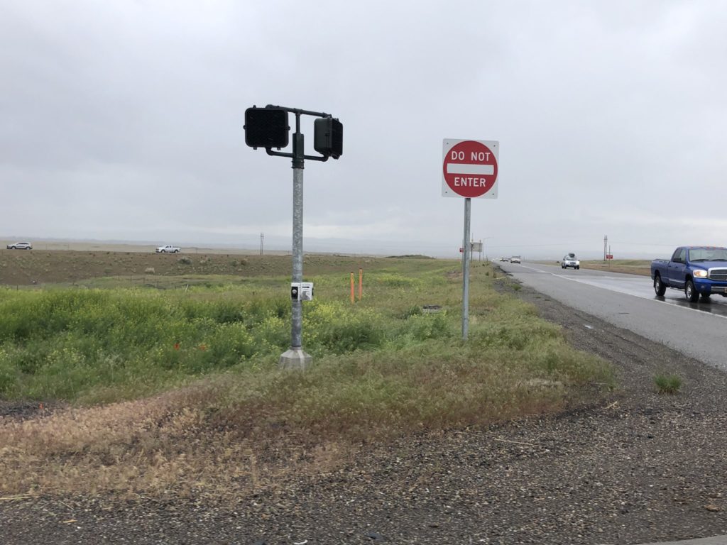
There are ways to detect non-motorized road users. The technology has been around for many years. It is not perfect, but it can work in some situations, like this one along the American Tobacco Trail in Durham, NC.
(The problem at the crossing shown in the image above is this crosswalk is part of the Boise River Greenbelt and runs alongside Parkcenter for a mile or so. It shouldn’t require Greenbelt users to push the button given the green time given to Parkcenter, but ACHD loves their Flashing Yellow Arrows, so they make everyone using the Greenbelt beg to cross the street at a substandard ramp. I cross this intersection frequently and never push the button. Few people do.)
While crossing Parkcenter at this location might be acceptable to push the button, such is not the case for crossing Spring Meadow (the street with the crosswalk shown in the left image). The Boise River Greenbelt runs along this side of Parkcenter and has very consistent foot and bike traffic. The signal cycles on Parkcenter are almost always long enough to allow a person to cross but ACHD engineers have chosen to not give the Greenbelt users an automatic walk signal. I observe it frequently and most people ignore the button and cross anyway.
The easiest way to spot a bad application of push buttons is to walk around the downtown area of a city. If the signals require a pedestrian to push the button, then it’s a bad application. If you’re not sure, go to a signal and don’t push the button. If you don’t get the walk signal automatically, then you’re in a beg situation.
We shouldn’t have to beg to cross downtown streets. People shop and tend to carry more things in their arms, which creates a hassle to have to push the button. Downtown areas have more families walking around where parents want to hold hands with their children. Street corners tend to be more crowded which makes it harder to know if someone pushed the button. Downtowns tend to have more disabled people using the sidewalk network and they shouldn’t be saddled with additional requirements in order to move freely about their community. You can argue that accessible signals should automatically provide the audible cues when in recall mode so someone who is blind or visually-impaired doesn’t have to find the button.
If you’re on an advisory committee, downtown business association member, or a citizen wanting to make walking easier in your downtown, then you should request signals be set to recall mode in downtown settings and other mixed-use corridors where pedestrian traffic is heavy. There might still be locations due to vehicle turn volumes and other features that the engineers hold on to the requirement to push a button, but those should be the exception and not the rule.
The beg function also reveals an inherent laziness in the traffic engineering profession. Agencies like ACHD and State DOTs love to tout how they are nimble in adapting traffic signals for congested situations. Not so much when it comes to people using their sidewalks. When ACHD conducted a study along Boise’s Capitol Boulevard someone asked for the signals to be set to recall mode for pedestrians at a major intersection where Boise State University students cross. This was their consultant’s response in rejecting that idea:
“Putting the intersection on pedestrian recall may make sense when school is in session, but there is not enough demand to warrant it when it is not in session so it should be left as pedestrian actuated.” (Page 52)
The Ugly Beyond asinine applications in downtown and park settings, I feel the root of the vitriol directed at push buttons comes in the widespread substandard engineering of their placement. I’ve cataloged dozens of horrific applications during my travels. The piss poor placement of pedestrian push buttons is standard practice.
Think about the levels of design, design review, engineer sealing the drawing, construction, and construction inspection that occurred to accept this as public infrastructure for people outside of a vehicle. (ITD’s US 93 near Twin Falls, Idaho)
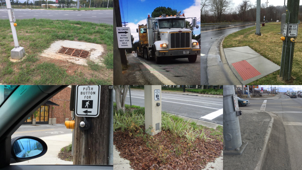
The image below shows several that were reviewed and inspected at many levels by state DOT engineers. My guess is many also involved the use of federal funding, which means FHWA didn’t catch the lackadaisical engineering that led to these situations. Buttons overhanging drainage grates. Buttons more accessible to motorists than pedestrians. Landscaped buffers between the ramp and button by the same agencies that won’t build landscaped buffer between sidewalks and their streets. All are ripe for an ADA lawsuit.
Top left: NCDOT at a Diverging Diamond Interchange near Charlotte. Top middle: Idaho Transportation Department in Bonners Ferry. Top right: NCDOT at a bus stop in Asheville, NC. Bottom left: NCDOT at an intersection along Merrimon Ave in Asheville. Bottom middle: Florida DOT in Tampa. Bottom right: Alaska DOT in Wasilla.
My all-time favorite comes courtesy of the North Carolina Department of Transportation along NC Highway 112 in Asheville. The video below shows just how lazy their consultants and engineers were in considering the basic needs of pedestrians. You must push this button to get the walk signal. If a person in a wheelchair or parents with a stroller were hit trying to cross this street but did not with a Don’t Walk signal, would the police even investigate the engineering of the push buttons? Would they realize engineering put that person in an unsafe situation and forced the person to break the law to cross the street? Probably not. The pedestrian would likely be blamed in the crash report and it would be just another tragedy chalked up to human error.
“When encountering someone outside of your immediate household, trying to remain at least 6 feet apart.” That’s what the National Institutes of Health (of Dr. Fauci fame) said in its Director’s March 19, 2020 post about beating COVID-19.
Have you tried that on a four-foot wide sidewalk that lacks a buffer from the street? What about on a sidewalk that has a railing or retaining wall on the back side of it? Have you attempted to keep your six-feet of space while passing someone on an 8-foot wide shared use pathway?
The recommendations to keep our space from other people during these crazy times are revealing the shortcomings in our dominant sidewalk and pathway design practices. What happens when you come across someone in a wheelchair or someone using another mobility device? How do you respect their needs and give them proper space? As the image below shows, what are our choices in keeping social distance from people in these situations?
Luckily, the above situation has open space on the backside of the sidewalk so there is an option to move to the grass to allow someone to pass and attempt to keep our distance.
But what about the situation below? This sidewalk is so tight due to its proximity to the street and the railing that it’s impossible for two people to walk side-by-side or pass one another without risking contact or having to walk in the street.
These design shortcomings revealing themselves during COVID-19 social distancing orders aren’t some type of secret. Prevailing design guidance used by transportation engineers and planners to make other roadway design decisions point to these design flaws.
The Highway Capacity Manual (HCM) is published by the Transportation Research Board serves as a go-to guide for transportation professionals to design roadways. It is primarily used–as you would expect–to make sure as many motorist inconveniences are addressed when an agency embarks on a corridor design or study. It’s where you find details on calculating things like motorist level of service.
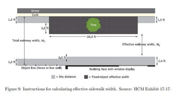
HCM also includes information on level of service and operational needs for people outside of cars. The figure below illustrates what HCM says about effective walkway width in relation to things like building faces or walls on the backside of a sidewalk or lack of a buffer between the curb and sidewalk. (Source: Page 25 of this pedestrian and bicyclist level of service paper from UCLA). A walkways functional width is reduced by 18 inches when it lacks a horizontal buffer from the curb adjacent to the street. That same reduction in effective width occurs when there is a vertical presence such as a railing or building on the back side of the walkway or when a sidewalk or pathway has a vertical barrier buffering it from moving traffic.
Federal Highway Administration’s (FHWA) Office of Safety mirrors HCM in its Pedestrian Road Safety Audits Guidelines and Prompt Lists: “Pedestrians rarely use the foot and a half of the sidewalk closest to the roadway or a building face.” (page 37)
Therefore, the picture of the person in the wheelchair moving along a four-foot sidewalk is really a 2.5-foot sidewalk if we look at effective width. That pictures of the two people walking on the four-foot sidewalk has an effective width of one-foot, according to the same design manual used by engineers to decide how to design space for motorists.
For bridges FHWA states:
“Often bridges are designed with only a curb separating pedestrians on the sidewalk from vehicular traffic. This measure alone is often inadequate as the curb does not form an adequate barrier between vehicular and pedestrian traffic. Vehicles traveling at speeds over 25 mph can mount a curb at relatively flat impact angles ” (page 38).
Now, that doesn’t mean the space is completely unusable, as you see in the image of the two people on the bridge, but it does make the space less safe and definitely uncomfortable. The person on the left has their left shoulder almost overhanging the road. How would it feel when they get buzzed by a truck operating close to the curb line?
This concept of effective or functional width in relation to a lack of buffer or presence of a railing is no different than the considerations that engineers give motorists when designing a bridge. They don’t put the motor vehicle travel lanes up against the bridge railing. Prevailing bridge design standards include a shoulder as buffer between the edge of the travel lane (or fog line) and the bridge railing. This is oftentimes four-feet of space or more.
How does this work in a pathway setting? We are fortunate to have a great Greenbelt system where I live in Boise, Idaho. Over the past two weeks I have self-isolated at home with the exception of a couple of grocery store trips and daily walks along the Greenbelt. The recent movement in many cities to invest in shared used pathways gives us better space to address our physical and mental health needs during the COVID-19 pandemic.
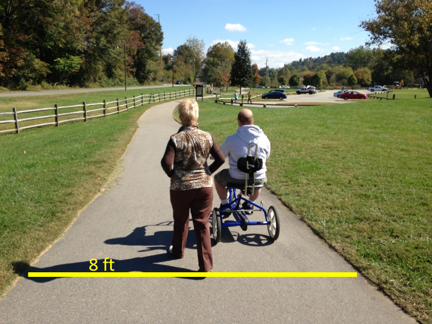
However, in these settings we still experience the results of design treatments that defaulted to a minimum width. The image below shows an 8-foot wide shared use pathway (the minimum width indicated in prevailing design guidance). How does one pass someone while going in the same direction and maintain the 6-foot distance being requested by health professionals? Engineers rarely design a street to have minimum dimensions for motor vehicle lanes (9 feet on collectors; 10 feet on arterials based on the AASHTO Green Book), so why do non-motorized users have to operate in pathways designed to the minimum dimensions?
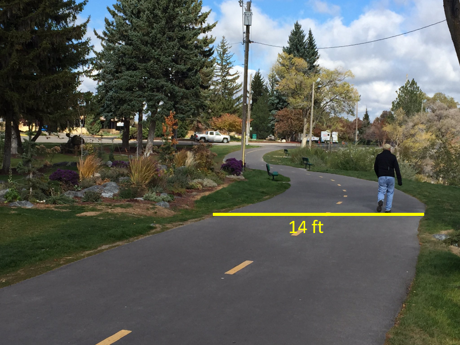
Compare that eight-foot wide pathway to the 14-foot wide pathway below. It provides much more space to pass in either direction and gives adequate buffer when someone like a bicyclist is passing at a greater rate of speed than the pedestrian.
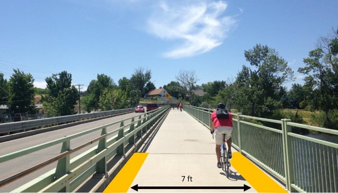
On bridges, the horizontal width considerations are even more important when considering functional width. This is due to bicyclists and their handlebars being at a width that can become entangled in railings. A common design treatment on pathway bridges is to simply carry the 10-foot wide pathway treatment through the bridge. That represents a failure by designers to consider functional width and shy distance. As the image below shows, a 10-foot wide tread width on a pathway bridge results in only seven feet of functional width.
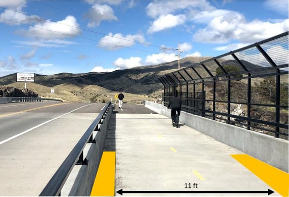
Compare that to this 14-foot wide pathway bridge (and note the generous buffer space from the railing given to motorists on the travel lane side). The design results in an 11-foot functional width. This image also illustrates the science of good design. Note the debris field inside the left side of the pathway railing. This collection of debris almost uniformly falls and stays in that 18-inch area.
Yeah, I’m the nerd who is out walking and bicycling and observing these things. I’ve also found that it has altered the routes I take on my daily walks and ride to avoid being subjected to substandard design that has the potential to compromise my health and the health of others during this pandemic.
Now that I’ve ruined your own experience, happy walking and bicycling! And stay well, my friends.